|
White Balance Compensation |
  
|
|
White Balance Compensation |
|
Menu: Adjust -> White Balance...
There are three ways of adjusting White point:
1. Histogram Shift
In the previous topic we learned about Histogram and its important functionality.
You may noticed that on many pictures the R,G and B curves look similar to each other, sometimes just shifted left or right. It is usual that you will see more shifting in the indoor pictures.
When the curves look similar but they are shifted (they don't overlap) it means your white balance of the digital camera wasn't set properly. And you may usually tell by looking at the histogram which color is mostly off.
Most of the digital cameras have automatic white balance, but it usually works best during daytime. Some cameras allows you to change the white balance program when you are taking images inside (and you can even change which light type you have). Some better cameras have a manual white balance where you can set the white manually.
What is white balance? - It simply means that a white color in a real life will become white on the image - which is not always true in bad light conditions - the white may look pink or blue. Automatic white balance should correct that in most of the "normal' lights and the manual white balance will certainly works best.
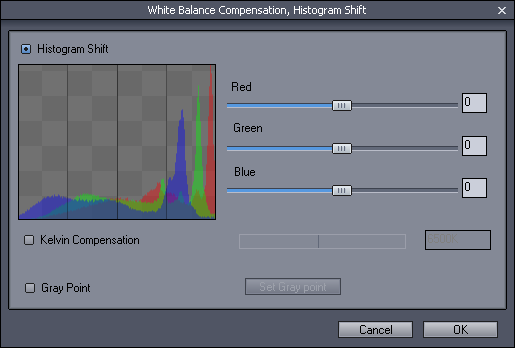
Histogram shift may help you to fix some troublesome white balance images, or at least determine what should be the next step. It displays the histogram and you can shift each curve with the slider. You see the result either on histogram or the image itself.
Note: The RGB curves may not always look similar. One or all may have different shape (the image may have little gray colors, but many different pastel colors) so it is important that you visually check the image itself -and as always, work a way so you like the result.
You should look for a similar peaks on all 3 curves in the right part of the histogram. The last peak on right certainly means whites and if the peak is visible on all curves (image has indeed whites) try to align the curves to this peak.
|
|
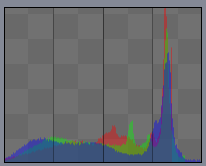
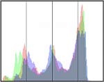
This indoor taken image may look fine for someone (little more on warm colors), but looking at the histogram we see that the blue is underexposed - it is shifted toward left, while the red and green are almost aligned. The most important part for us is the alignment on the right side - alignment of the grays and whites. |
|
|
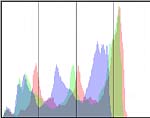
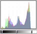
With the sliders we move the green a little to right and blue again to right, but more so the highest peaks overlap. The image will look more natural. However there is a big gap on the right part which only means that the camera didn't take the whole intensity spectrum and the white isn't white but grayish. |
|
|
The next logical step is to open Levels and adjust the tonal range of the image so it will fill the whole intensity bandwidth. The image now looks fine, white looks white and the image has nice contrast. |
Remember that you should shift toward the area where are less colors or maybe a gap. Like in the example above we were shifting blue and green channel to right (toward the gap) not the opposite way - shifting red and green channel to the left. This will make sure we don't cut too many shades of colors out.
2. Kelvin Compensation
![]()
Use the dial to change the Kelvin temperature and watch the preview image
3. Gray point
![]()
Use an Eyedrop tool to pick a neutral color (gray) from the image.
| • | Select Gray point option |
| • | Click on the Set Gray point button, it will become Red |
| • | Cursor will change to eydroper |
| • | Click anywhere on the image where the area should be of neutral color |
| • | The correction will be calculated. |
While using eyedroper you can watch the histogram - in many cases when the peaks overlaps you found neutral color. (depends on the subject)